Life expectancy and income across 200 countries
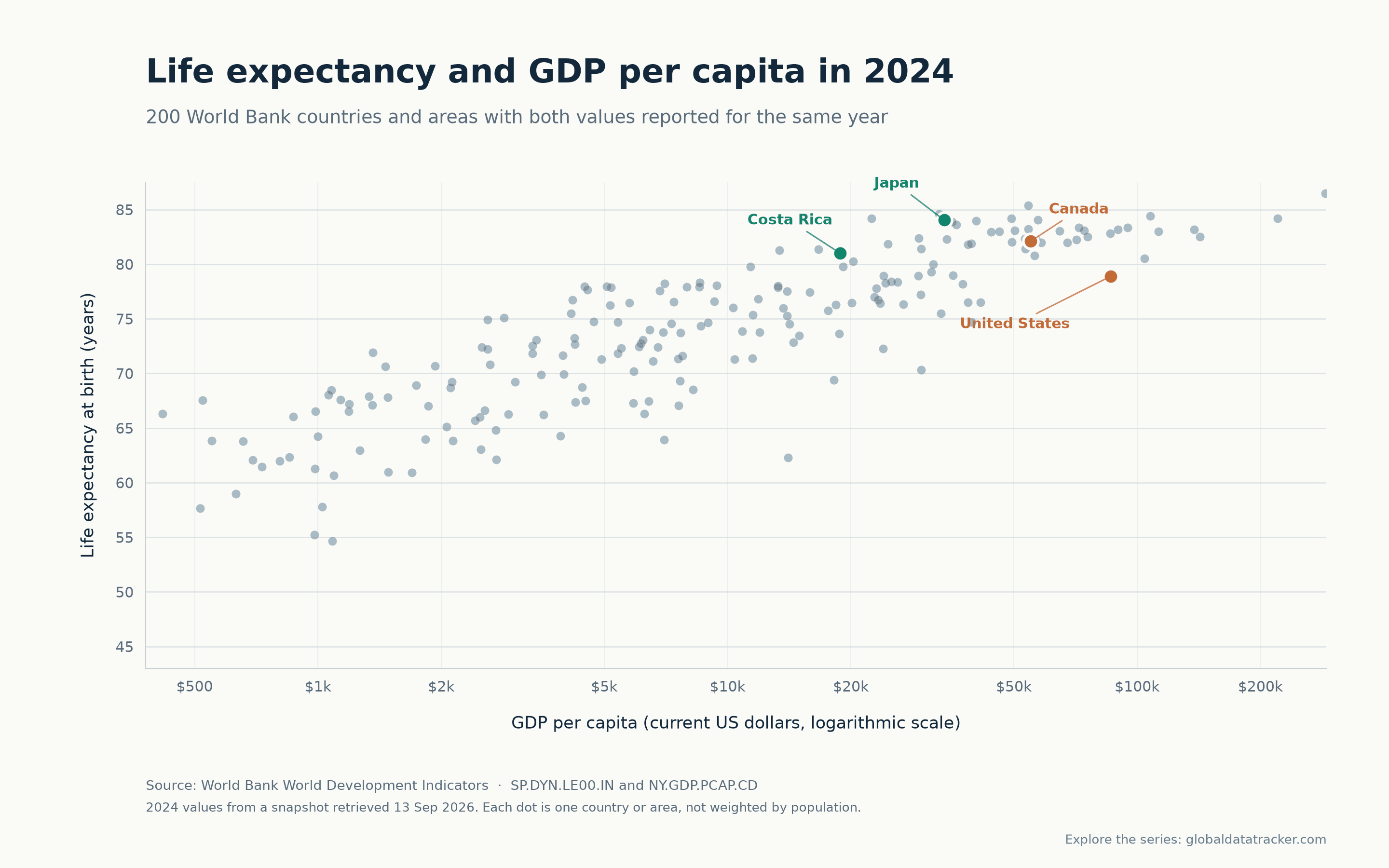
Higher income and longer lives tend to go together. This chart shows the broad pattern—and how much countries can still differ at similar incomes.
How to read it
The horizontal axis is GDP per capita in current US dollars. It is logarithmic: moving the same distance to the right means multiplying income, not adding a fixed dollar amount. The vertical axis is life expectancy at birth, in years.
Each country or area has equal visual weight, regardless of population. GDP here is nominal, not adjusted for local prices or purchasing power. The relationship is descriptive; the chart cannot tell us why any country is above or below another.
Four labeled examples
Costa Rica
81.0 years life expectancy
$18,853 GDP per person
Japan
84.0 years life expectancy
$33,797 GDP per person
Canada
82.1 years life expectancy
$55,016 GDP per person
United States
78.9 years life expectancy
$86,170 GDP per person
These are the values in the chart’s World Bank snapshot, rounded for display. They do not adjust for population size, uncertainty or differences in national measurement methods.
Explore the underlying series
Compare countries, change the year and open the historical charts. Each statistic shows its reporting year and original source.
Data and method
This plot uses the World Bank World Development Indicators series for life expectancy at birth (SP.DYN.LE00.IN) and GDP per capita, current US$ (NY.GDP.PCAP.CD). It includes the 200 countries and areas in our published snapshot that have positive GDP per person and both values under the 2024 reference year. No missing values were filled in for the chart.
The snapshot was retrieved on 13 September 2026. World Bank indicator values may be revised and can include provider estimates. Reference years do not guarantee that all underlying national measurements use identical periods or methods. I made the chart with Python and Matplotlib, with AI assistance for implementation and wording.
Read the site methodology